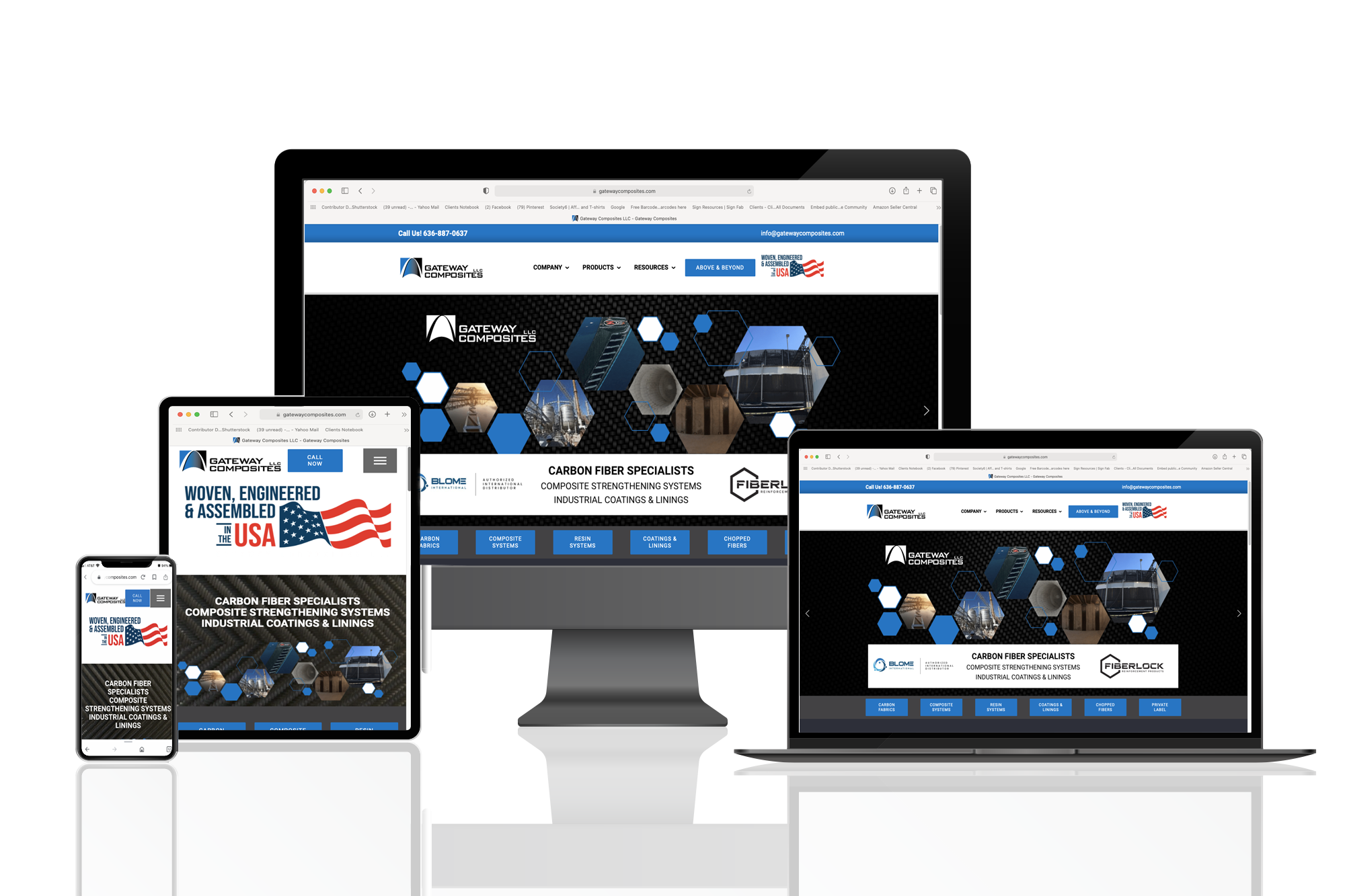
Navigate Through the Age of Mobile with Print Media Corporation
How many devices do you use? The average person uses a combination of smartphone and laptop. Tablets and desktops follow. Smartphone are mostly used by the consumer persona. However, everyday more and more business is conducted on smartphone. Essentially, a smartphone is a computer and it’s used that same way, it just has more features than your laptop or desktop.
It’s crucial that your business is mobile friendly. Your website should be 100% responsive for desktop, laptop, tablet and phones. Why? They render differently. How your site is viewed on a laptop vs. desktop vs. tablet and phone is different. Different screen sizes, resolutions, and browsers.
Believe it or not, internet explorer still exists. It’s legacy, but not everyone has upgraded to edge. Use Google Chrome or Firefox? They also render differently. It doesn’t stop there. iPhone users have a default browser, Safari. Websites need to conform to each browser to offer the best user experience.


